Category Archives: visual

Boring old headshot… really??

I recently saw a statement on social media that made me read further… it read ‘don’t want a boring old headshot?’ It occurred to me that I’ve never seen a ‘boring old headshot’ – a poor one perhaps, but not boring. It might be poor in its technical production, for example, poorly lit and too dark, too much contrast, out of focus, an old holiday snap, wrong angle… and then there’s the expression… stiff, nervous, apprehensive, serious and decidedly questionable. So if the offering to pep up a ‘boring old headshot’ is to put someone on a brightly coloured background,  what about that expression??

90% of the success of a good headshot is in the expression. Many people who dislike their photograph being taken, will also say they would like to be captured as ‘friendly and approachable’. Yes you can have a fantastic fine art portrait of someone with a non-smiling expression. It could be wistful, contemplative, cheeky, thoughtful… but for business engagement that’s probably not the best style to go for. There is a friendly and approachable expression in all of us… after all it’s part of our personality.

Our image says a great deal about us and if you form opinions of others by their online image before you get to meet them, you can be sure others will be doing the same about you.

So if you want to encourage trust and engagement with others in your business world, friendly and approachable is the best way forward. Not fixed and posed, but natural and spontaneous… and definitely not boring, whatever background is decided upon.

Professional headshots - wall of fame

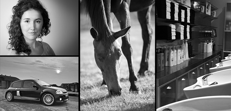
Professional headshots on different backgrounds.

Professional headshots packages for those less than comfortable in front of the camera.

A – Z Photography tips and information… B

(B) is for black and white – sometimes the success of a shot is in its simplicity and removing the colour can aid this and change the focus. Plus, mixed with the right lighting (covered under ‘L’) it can bring a great ‘mood’ quality to the image, shown below in a small selection of very different examples.

Black and white photographs

(B) is also for… background – not so obvious, to the point it’s easy to forget them altogether – especially when you are concentrating on your foreground image! Then you end up with objects suddenly appearing in your finished composition that you hadn’t seen at the time of capture! A telegraph pole sticking out the top of someone’s head is never a good look!

So look out for them! A shifting of the camera or your position (often quite small) can save the whole composition of your image. The photo below of the young lady sitting on the beach is a simple example, positioning her in between two upright posts in the background that have strong shadows. If you have a tricky background, observe if it’s possible to use it to your advantage, i.e. frame your image with the background… or move altogether and get another angle.

There are other factors to consider with backgrounds covered further on in the series, so watch out for those 🙂

Background example
I’ll try and remember to refer back to comments mentioned under previous letters that may be relevant to another tip 🙂


Edinburgh Festival Fringe


Two of the images I took last year of Juliet Aster working on her visual art work ‘Regretrospective’, are being used to promote the piece at the Edinburgh Fringe. I also turned one of them into her promotional flyer, that will be amongst the millions of flyers scattered on the streets of the big city. You can see a larger versions of these two images – http://pennymorgan.photoshelter.com/gallery/Dance-Art-Regretrospective-rehearsal/G0000FIPQwgNDHtE/P00003z3fyUgheZc

Article in ‘Roundabout’ magazine

Now I know I blogged about some of this earlier in the month, however there’s an article about Juliet, her work and the photography I did of her, in the November issue of ‘Roundabout’ Magazine, just about to come out – so watch this space as they are currently still showing October issue http://www.roundaboutsuffolk.co.uk/index.php – or you can take a look at the November issue here http://issuu.com/heavens_and_earth_art/docs/rb_2009_11_nov_web and view the article (click on black background spread).
I’ve also featured images on my home page of both pieces I’ve photographed of Juliet from last year and this year. Any feedback on the article and photographs would be great.

Regretrospective rehearsal shots

For those of you interested in visual art, take a look at a selection of shots from Juliet Aster’s new work ‘Regretrospective’, to be performed at Colchester Arts Centre, November 12th.

Part installation, part film, part devised dance theatre, the work touches on many subjects, the implications of regret, desire, loss, delusion and illusion and is surreal, disturbing and funny in equal measure.

My personal favourites are the demon shadows – great fun to photograph!

http://pa.photoshelter.com/c/pennymorgan/gallery/Regretrospective-rehearsal-photos/G0000FIPQwgNDHtE/P00003z3fyUgheZc